Spread the Word: Beautiful Testimonial UI Examples

Everybody wants to receive positive feedback for a job well done. That’s one reason why so many businesses include testimonials on their website.
Beyond the warm and fuzzy feelings, testimonials can also help recruit new customers. Knowing that others have had a good experience inspires confidence. In all, it’s a happy little cycle that helps to keep business booming.
In terms of implementing a testimonial UI, simple is often better. That doesn’t mean they have to be boring, however. The clever use of color, layout and special effects can turn your testimonials into something that stands out.
Let’s take a look at some examples that will give your testimonials a place to shine.
All Aboard the Carousel
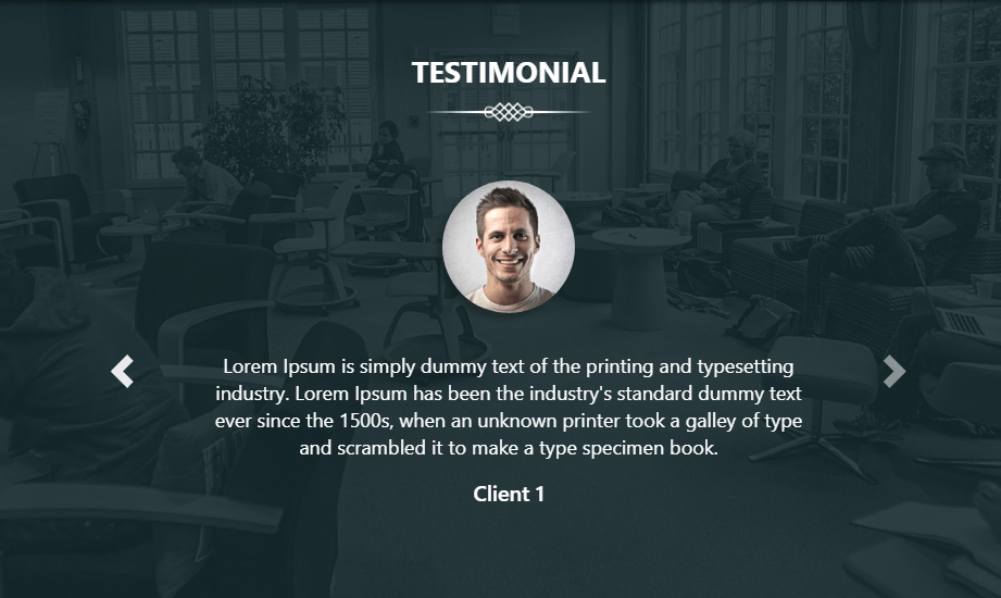
Testimonials are often paired with sliders and carousels for both interactivity and efficiency. A number of examples in our collection utilize them. However, this example is unique in its design. While there are standard navigation arrows at the bottom of the feature, clicking on the client photos on either side will also enable you to slide back and forth.
Shapes and Rainbows
If you’re looking to add a testimonial section to your page that stands out, it would be hard to top this. First, there’s the animated, color-changing gradient in the background. Second, the use of CSS clip-path makes for an awesome badge-like look on the images. Even with all of that, the UI is still simple and classy.
No JavaScript Required
For all the CSS purists out there, here’s a solution that doesn’t need a single line of JavaScript. While it’s nothing earth-shattering in terms of looks, that’s actually a good thing. It leaves plenty of room for you to style it to match your needs. In addition, this would fit nicely in a relatively small space.
It’s in the Cards
This card UI is both simple and beautiful. Each card has its own background photo – presumably to use a client’s photo or logo. CSS opacity is used to allow enough contrast to place white text on top. It also encourages the use of smaller amounts of content, which is much easier to digest than a longer testimonial.
A New Angle
The design is what we’re focused on in this non-functioning demo. It goes to show that simplicity can be really effective. The slight angle on the background photo draws your eyes in, while the generous padding around the quote itself gives off an airy feel.
Hover Quotes
Here’s a different take on a testimonial UI. It’s full-screen, and you have to hover over images to see each person’s respective quote. The look is incredibly sharp and the transitions are smooth. This could be a nice choice for more artistically-focused websites.
A Different Take
There’s a lot to like in this example. The side-by-side carousel layout makes for an interesting visual effect. Images move to the left as quotes change on the right. Speaking of the quote area, it offers plenty of whitespace and is easy to read. It makes for a package that is anything but typical.
Color Card
Another prime example of simplicity, this card layout uses a couple of CSS effects to differentiate itself. First is the slightly-rotated quote mark in the background. CSS transform is used to break uniformity – in a good way. Also, the colorful gradient in the footer makes the whole card, dare we say, “pop”.
Beautiful Praise
The whole idea behind collecting testimonials is demonstrating that you know how to make customers happy. For a number of different businesses and organizations, they serve as a key selling tool.
When it comes to displaying testimonials on a website, there are a number of compelling options. The examples above show how the use of color, movement, typography and layout can all play an important role in building an attention-getting UI. It’s up to you to decide which approach works best for your brand.
Want to see even more testimonial UIs? Take a look at our CodePen collection and discover what else designers are doing.
